| Highest Elevation |
 |
| Lowest Elevation |
Standard Elevation Map
Throughout this study, numerous topographical maps will be presented as Standard Elevation Maps. A standard elevation map attempts to depict the relief (changes in elevation) of the landscape by using a color coding scheme. Every standard elevation map in this study uses the following color scheme: yellows represent the lowest elevation, then greens, blues, and finally reds as the highest elevation.
Figure X.1 illustrates the concept.
|
|
|
|||
| (a) | (b) | |||
| Figure X.1 | ||||
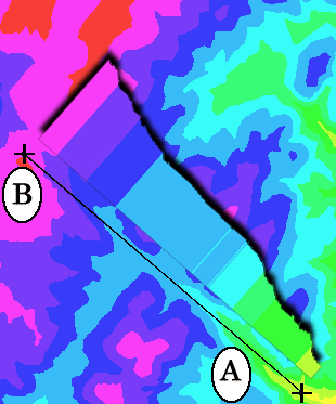
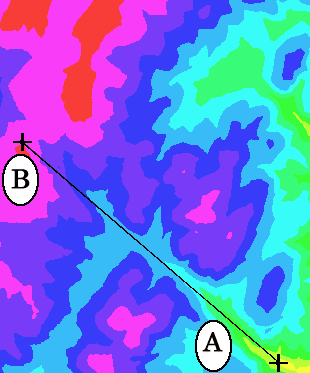
In figure X.1 (a) is a color coded standard elevation map of a region on the battlefield. X.1 (b) is a key that maps colors to their respective relative elevations. Note that the color scheme is relative: Red is the highest elevation within the region shown in the map. Points that are red in two different maps of different regions are not necessarily of the same elevation. This is done so that each map can have the full span of colors from yellow to red, to bring out as much detail as possible.
Superimposed on Figure X.1 (a) is a line that stretches between two points, marked A and B. Point A is located in a yellow area and is therefore low, and B near a red area and therefore higher. The line AB should therefore represents a general inclination in elevation.
|
Figure X.2 shows the same area as Figure X.1 (a), but with the profile of the ground along the line AB superimposed. The profile is a 'side view' of ground, showing how the ground's elevation changes with distance. Profiles are nearly always exaggerated to bring out the detail. |
|
Figure X.3 shows the profile extracted from Figure X.2. As expected, the line AB represents a general inclination of elevation. |
Standard elevation maps are very useful for grasping the general shape of a landscape. Another technique often used to suggest elevation is Contour lines. While contour lines are very effective at showing precise elevations, they are poor aids to visualizing the landscape.