| 100th Percentile Within Neighborhood |
 |
| 1st Percentile Within Neighborhood |
Normalized Elevation Maps
A Normalized Elevation Map is a tool used to illustrate the elevation of a point relative to its immediate surroundings. This is an important distinction from a standard elevation map, which measure the elevation relative to sea level. For example, the Mountain House in Fox's Gap is without question at a higher elevation than the Miller Farm at Antietam. Fox's Gap is so far away from the Miller Farm, however, that it is irrelevant; Nicodemus Heights--an insignificant feature compared to the Fox's Gap--is actually far more significant to the Miller Farm, due to its proximity. Its not a point's elevation that matters, but rather its elevation relative to its surroundings.
A point's normalized elevation is defined as its percentile rank relative to some defined neighborhood around the point. A neighborhood can be defined a variety of useful ways, but typically is simply the circular region of some radius. For example, for a given location, if we were to sample 999 other points within a 100 meter radius and found that of the 999, 150 were higher, than the percentile rank of that point (relative to 100 m) is
| Total Number - Number Higher Than | 1000 - 150 | ||||
| = | = | 0.85 | |||
| Total Number | 1000 |
which means the point is in the 85th percentile.
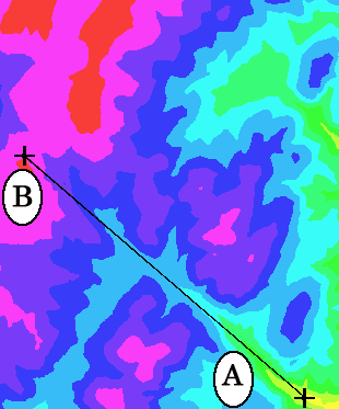
Like standard elevation maps, normalized elevation maps are shaded using a color scheme. Yellows represent the lowest percentile rank, then greens, blues, and finally reds as the highest percentile rank.
Figure X.1 illustrates the concept.
|
|
|
| |||
| (a) | (b) | (c) | |||
| Figure X.1 | |||||
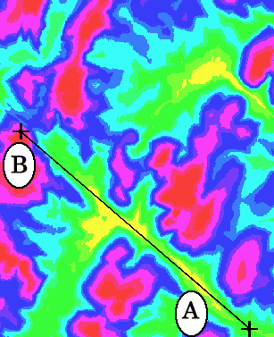
In Figure X.1 (a) we have a normalized elevation map of the exact same region as described in Lesson 1.1.1; the standard elevation map from that Lesson is reproduced in Figure X.1 (c). Figure X.1 (b) shows the color key used to interpret the normalized elevation map.
Superimposed on Figure X.1 (a) & (b) is the same line that stretches between the two points, marked A and B, from Lesson 1.1.1.
 |
 |
| (a) | (b) |
| Figure X.2 | |
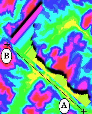
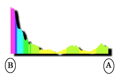
Figure X.2 (a) shows the same area as Figure X.1 (a), but with the profile of the ground along the line AB superimposed. The profile is a 'side view' of ground, showing how the ground's normalized elevation changes with distance. Alongside X.2 (a) is Figure Y.2 from Lesson 1.1.1, the same region rendered as a standard elevation. Note that the scales for these two profiles are completely different.
 |
 |
| (a) | (b) |
| Figure X.3 | |
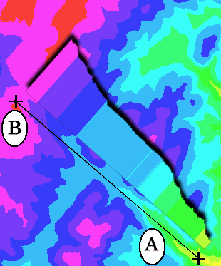
Figure X.3 (a) shows the profile extracted from Figure X.2 (a). Figure X.3 (b) is Figure Y.3 from Lesson 1.1.1 shown alongside for comparison.
The two profiles in Figure X.3 draw out the difference between standard and normalized elevations. If an observer were to traverse the line AB, that observer would--according to X.3 (b)--experience a consistently uphill climb. The experience described in X.3 (a) is quite different: after a short climb (the first green region near A), the observer descends, relative to their surroundings (the first yellow region). Continuing toward B, the observer climbs into the second green region, but then descends yet again even deeper than ever into the second yellow region. After climbing out of the second yellow region, the observer makes significant gains as they reach the hilltop at B.
This example illustrates how along a certain path one might constantly gain elevation (compared to a distant standard, such as sea level) yet actually lose ground compared to their immediate surroundings. In other words, the ground around them is rising faster than they are. Since the value of 'sea level' is irrelevant to land combatants, the normalized elevation of a certain position or region better describes its tactical significance than does its actual elevation.
The key to using normalized elevation concepts is to defining the neighborhood's size and shape in a meaningful way.